
2026 / Client mission
La Boutique de l'Espérance
Redesigning a religious goods store without switching themes or taking it offline: one visual identity from homepage to checkout, a readable mobile experience, and an owner who now runs her content herself.
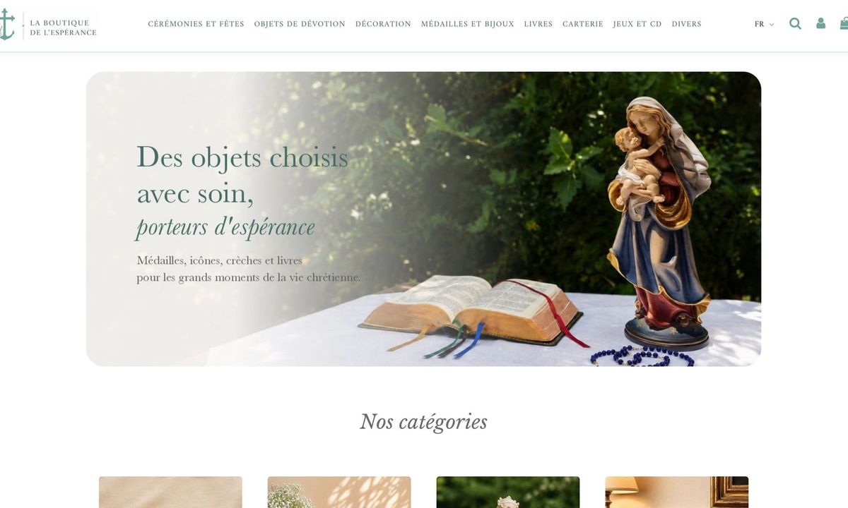
New look, same theme, same catalogue, zero downtime. From June to September 2026, I reworked the entire shopping experience of La Boutique de l'Espérance, from the homepage slider down to the checkout, while real orders kept coming in every day.
Context
La Boutique de l'Espérance is a Catholic family business based in Bélâbre, a small town in central France. Since 2017, it has sold devotional items in its shop and online: rosaries, statues, icons, medals, books, and gifts for the milestones of Christian life, from baptism to ordination.
The store ran on PrestaShop 1.7 with Warehouse, a premium theme backed by a stack of plugins (Elementor, Mega Menu, Slider Revolution, product reviews…). Several platform migrations had left their mark:
- colours pulling in every direction: theme blues, brown, grey, orange;
- a homepage still full of demo content;
- stray English strings in the French checkout;
- dead links in the menu;
- a mobile site that was barely readable.
The brief: roll out the brand palette (celadon, charcoal, green, cream) across every page, turn the homepage into a real storefront, fix mobile, and hand the owner a site she can keep running on her own.
Approach
A homepage that actually sells
I rebuilt the homepage as a guided walk through the store. A full-width header with a single-line menu, then a clean image slider, eight category tiles, a new arrivals carousel, and a "Gifts for every occasion" row whose seven tiles follow the order of the sacraments and the Church calendar. Trust badges, a newsletter signup and a short story of the business close the page above a slimmer footer.
Slider Revolution went out in favour of PrestaShop's native slider. Less flashy, far more practical: the owner swaps a slide in two clicks, and each slide gets its own mobile image so the text stays legible on a phone.
The finishing touches mattered too: the logo recoloured in charcoal, product labels unified into rounded pills with one font and one set of greens, and the English homepage and menu brought back in line with the French ones.
Mobile: one setting, fixed everywhere
On phones, everything was tiny. Breadcrumbs at 8 px, prices you had to squint at, a cart that was a chore to use. Instead of patching each element, I went looking for the cause. The theme's configuration set the base font size to 10 px on mobile, and the whole theme was built on relative units. Raising it to 13 px fixed breadcrumbs, prices, stock labels, cart and checkout in a single move.
From there: a header that stays on one line down to 320 px wide, a mobile menu with a proper backdrop, a readable cookie banner, tighter sections, two-column filters, and carousel images that finally load.
A consistent path to purchase
Product listings got larger titles, a filter column with item counts, and clear sorting and pagination. Product pages got better-framed photos, a sticky buy bar showing the price, a new quantity picker, a consistent stock badge, and no more duplicated content. The cart and the add-to-cart modal became easier to read and to tap.
Compliance and translations
The cookie banner now has a real "Decline" button, and Google Tag Manager only loads once the visitor has agreed. The remaining English strings in the French storefront were translated in the child theme, leaving PrestaShop's core untouched.
Working on a live store
The whole project ran on short feedback loops with the owner: she sent annotated screenshots, I answered point by point, and every change was checked on the live site once shipped. Anything structural started as a standalone HTML mockup, approved before being rebuilt in Elementor.
Two audits set the pace: a full UI/UX audit in early July with 32 prioritised items, then an external mobile audit in September, worked through item by item.
Every fix was verified with actual measurements in an automated browser (widths, heights, font sizes, contrast) at six screen widths from 320 to 1920 px, using a genuine mobile user agent. The theme serves different HTML to phones, so simply resizing a desktop window would have told the wrong story.
Under the hood
One rule guided the whole project: change settings where they live instead of piling CSS on top, and remove overrides once they're no longer needed. On a premium theme where every setting exists in three places (database, JSON config, compiled CSS), that discipline is what stops a single click on "Save" from wiping out weeks of work.
In practice:
- Scripted Elementor edits: reading and writing page JSON, transforming it in JavaScript to reorder sections, translate widget by widget and keep French and English in sync.
- Versioned theme configuration: a 526-key reference JSON, re-imported to regenerate the CSS and keep the database aligned with the source.
- Child theme: template overrides for the slider, cookie banner, GTM tag, sorting and product pages.
- Automation: back-office forms driven by Playwright, down to the 34 labels of the English menu; logo recolouring and slide composition in Python.
- Clean-up: duplicate categories merged with their products reassigned, dead links caught by diffing the French and English menus.
Result
One coherent store from homepage to order confirmation, with gains you can measure:
- Mobile type: base size up from 10 to 13 px, breadcrumbs from 8 to 12 px, listing titles from 11 to 14 px.
- Header at 320 px: from 124 px on two lines to 64 px on one.
- Desktop footer: from 393 to 308 px tall.
- Mobile homepage: 475 px less scrolling.
- Zero dead links in either menu, zero English strings left in the French checkout.
- Consent that means something: no analytics script loads before the visitor accepts.
Most importantly, the owner is in control. Text, images, categories and slides are all editable from the back office, with a handful of simple rules for image sizes and cache refreshes. The store no longer needs me to keep moving, and that's exactly what I set out to leave behind.
Stack: PrestaShop 1.7, Warehouse with a child theme, IQIT Elementor, Theme Editor and Mega Menu, Smarty, XLIFF, Google Tag Manager, Swiper, GSAP, Python, Playwright.